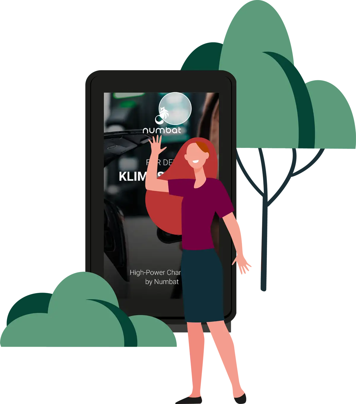
We have prepared Creative Guidelines to help you create visually appealing advertisements for your audience. These guidelines include technical requirements for your ad and information on the types of ads that can be displayed on screens.
Creative Guidelines
With DOOH, you can create integrated moving image campaigns that cover the entire customer journey. Digital screens fill the advertising gaps between the first glance at a smartphone or daily newspaper in the morning, search engine research at the office, and evening TV commercials.
To put it simply, digital out-of-home advertising reaches consumers at different locations in public spaces throughout the day. This type of advertising can be tailored to specific audiences for better targeting.
Splitting the Spots
To optimize human perception, a 10-second spot can be split into two frames of 5 seconds each or three frames of 3-4 seconds each.
For clear communication, the division of the content can look like this, for example:
Frame (3 seconds): Brand and key visual
Frame (4 seconds): Headline
Frame (3 seconds): Price disruptor
Frame 1
Frame 2
10 Seconds
Frame 1
Frame 2
Frame 3
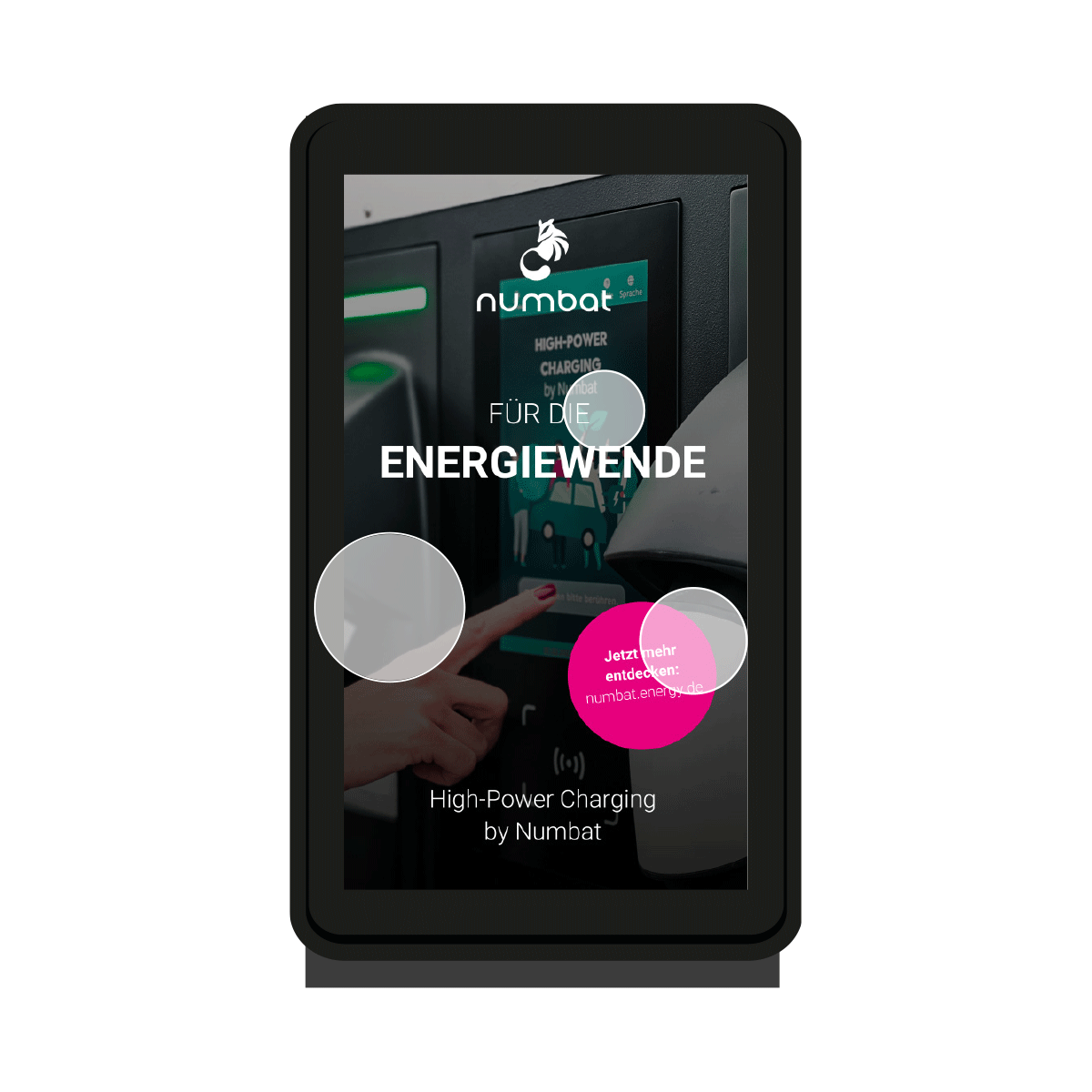
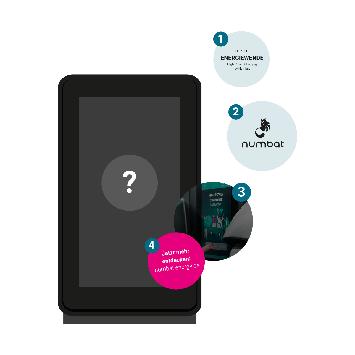
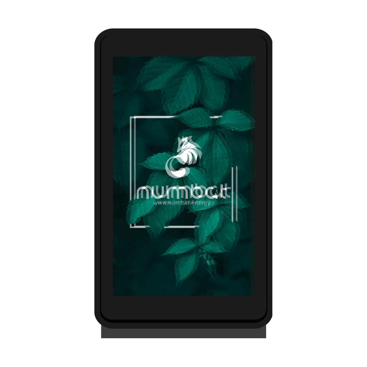
The logo placement
To ensure a direct association with the company, the logo should be prominently displayed in the upper third of the advertisement with high contrast at least 90% of the time. This will prevent the logo from being obstructed by pedestrians and attract greater attention.
The core message
The advertisement message should be clear and easily comprehensible to the audience. The key aspects to emphasize are the brand, which should evoke positive emotions, and the product, which should inspire a desire to purchase.
ATTENTION! Remember to comply with youth protection guidelines (FSK0) and avoid political and religious expressions of opinion. Numbat reserves the right to reject content at any time without explanation.
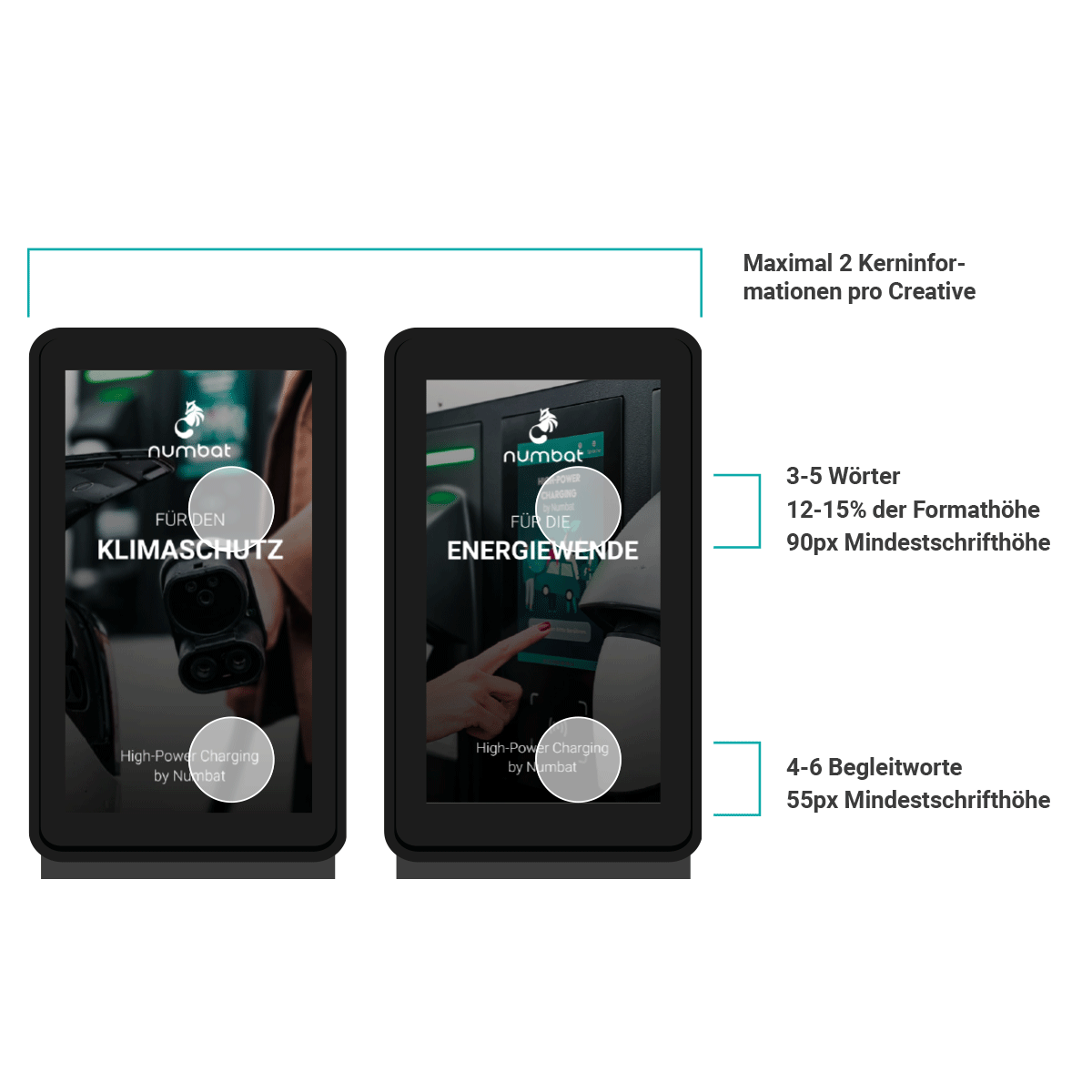
The Content
To make an effective advertisement, use a maximum of two core messages per spot, with one message per frame. Keep the message brief, using only three to five words that take up at least 12-15% of the format height.
Using fewer words ensures the message is easily absorbed. If additional text is necessary, limit it to four to six accompanying terms. Use a minimum font height of 90px for the headline and 55px for the sub-headline.
Call-To-Action
It’s important to have a clear Call to Action (CTA) in your advertisement that prompts the viewer to take action. This can include providing information or directing them to another communication channel. Keep the text brief but informative. Using attention-grabbing terms like “New”, “Now”, or “Attention” can also help generate interest.
Imagery
When using images in advertising, it’s crucial to ensure that they effectively support the message being conveyed. The message loses impact if the graphics and message don’t complement each other. For optimal results, images should occupy 80% of the screen while the remaining 20% should be allocated to text.
Less is more
To achieve the best results, advertising must prioritize four key elements, with one of them being the logo.
Arrangement
To guide the viewer’s focus, arrange the elements strategically. Position the main element in the center and place other elements around it that are not intended to be the main focus.
Movement and Animation
To effectively convey a message in advertising, it’s important to minimize distracting movements and instead focus on targeted actions that reinforce the message. This can be achieved by incorporating clear resting and standing phases and strategically setting attention peaks to capture the viewer’s gaze. By doing so, the advertising becomes more attention-grabbing.
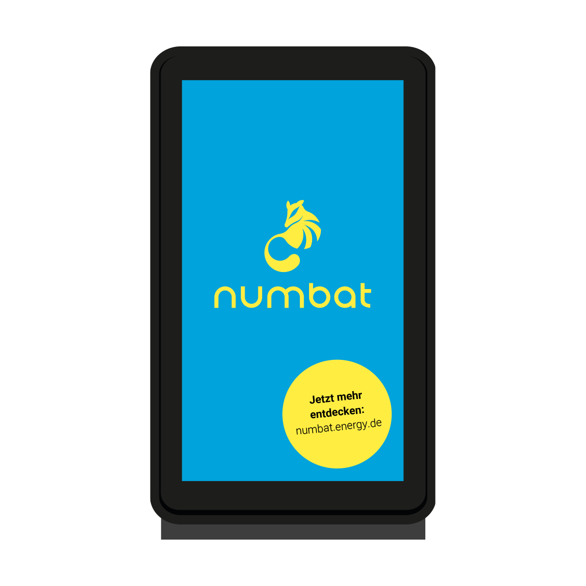
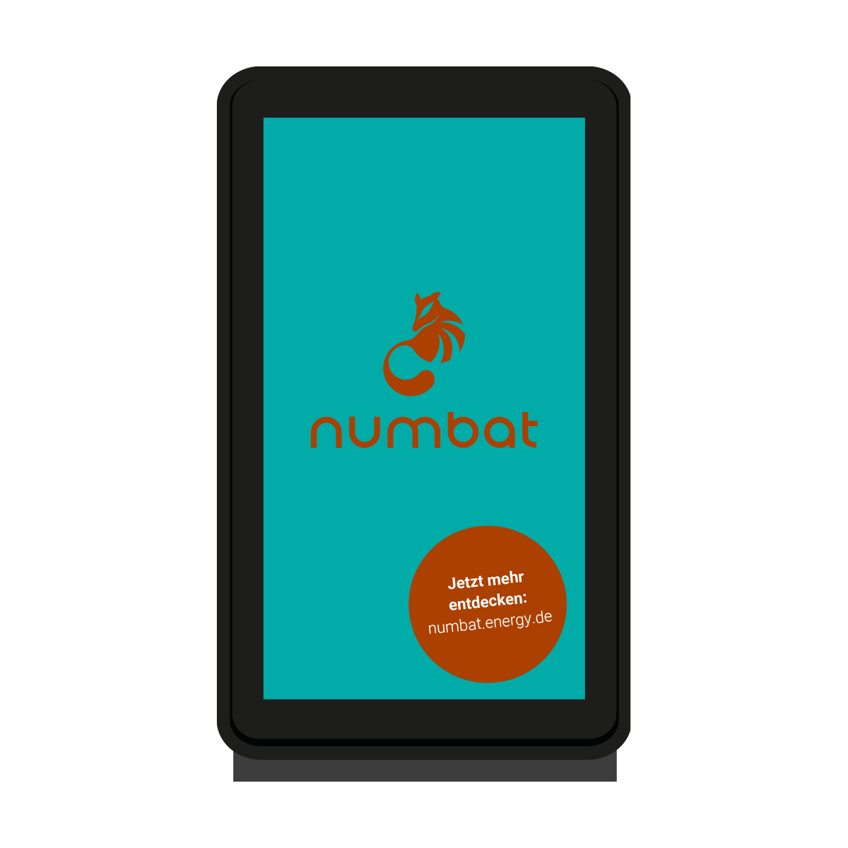
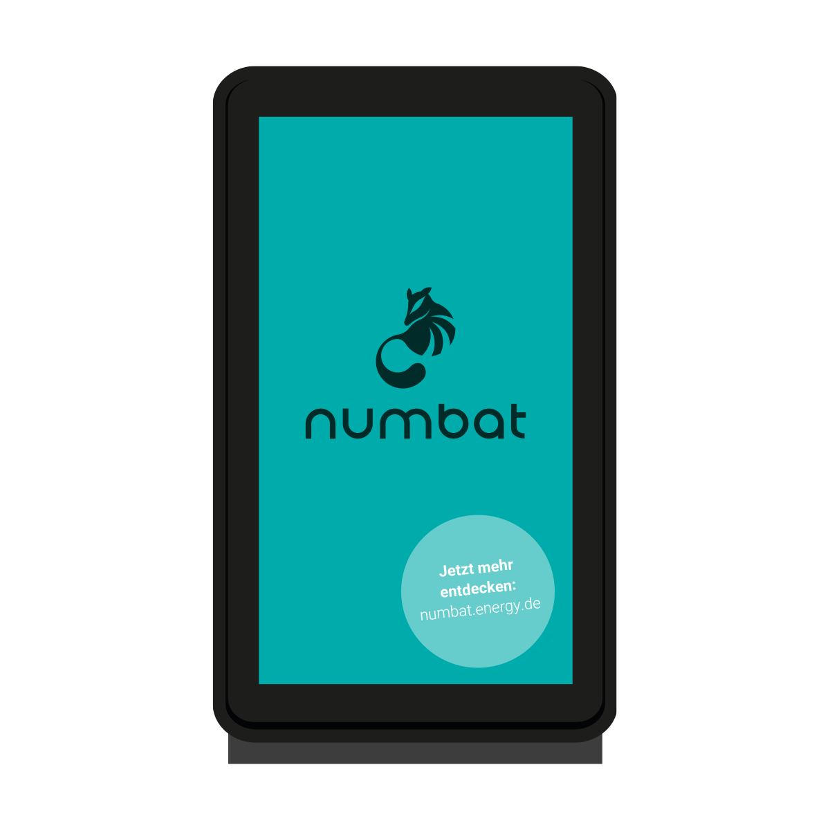
Colours
When creating advertisements, it’s important to use appropriate colors to capture the viewer’s attention and create a positive experience. However, using too many colors can cause confusion. To ensure proper color coordination, different types of color contrasts can be utilized.
Color-on-contrast
To increase visibility, it is recommended to stick to using two or three main colors.
Complementary Contrast
To create a vibrant design, use a combination of a primary color and its complementary color.
Quality Contrast
For top-notch advertising, use off-white colors that are in the same hue as either primary or secondary colors.
Design Opportunities
The type of advertising available may vary based on the location. In busy areas or certain cities, there may be restrictions on certain types of ads.
Moving Images
Classic videos, full-screen or backgrounded.
Animation
Full Animation
Highlight effect for text and image elements
Fade in and fade out layout elements
Cinemagram
Combination of still image and a constant moving element
Loop-Movements
No fade-in & fade-out of text & layout elements
Still Image
No Movement
Technical Requirements
Still Image
Duration: 10 seconds
File Format: jpeg, png (72dpi, sRGB)
Resolution: Full HD: 1.080×1.920px 4K: 2.160×3.840px
Moving Images
Duration: 10 Sekunden
File Format: jpeg, png (72dpi, sRGB)
Resolution: Full HD: 1.080×1.920px 4K: 2.160×3.840px
Framerate: 25 fps (progressive)
Bitrate: max. 30 Mbit/s
Coding: H.264
Contact
If you’re curious about the Numbat and our charging solutions, or want to explore the vast options of energy management and EV-DOOH applications, reach out to us without delay. We’d love to share more information with you.